- Home
- add-ons
- Dynamics NAV & Dynamics 365 Business Central Apps
- nHanced Quick Reports & Views
nHanced Quick Reports & Views
Giving you visual representations of records and the ability to create and manipulate your own reports in minutes!
Cut straight to the chase and watch a demo of nHanced Quick Reports & Views to find out what it can do for you!
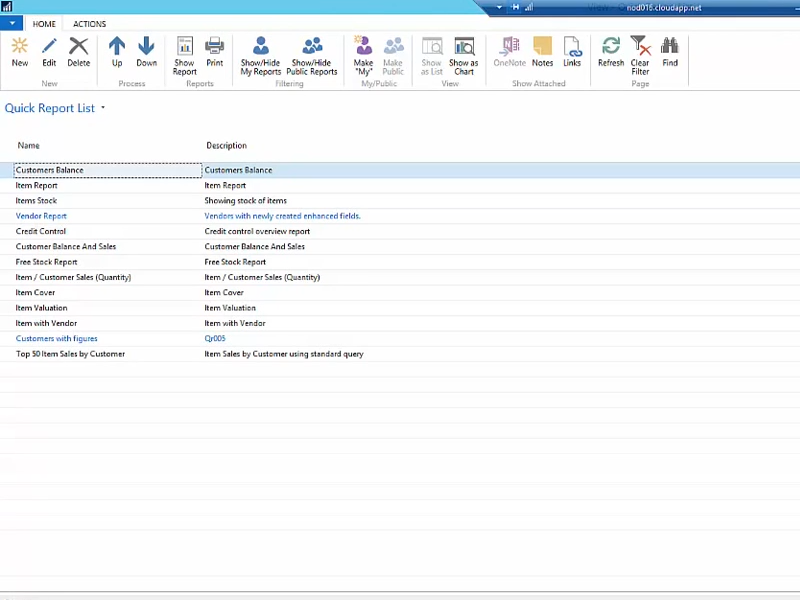
There are plenty of tools out there in the Dynamics world to help users review and analyse the data from inside their Dynamics NAV or Dynamics 365 Business Central system - Jet Analytics and Power BI to name just two. As powerful as these tools are, they do require some setup and training to use. We set ourselves the task of creating a simple tool that runs inside your system to quickly and easily provide a way to generate simple, great looking reports on your data. nHanced Quick Reports & Views were born!
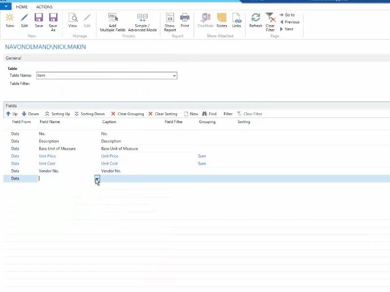
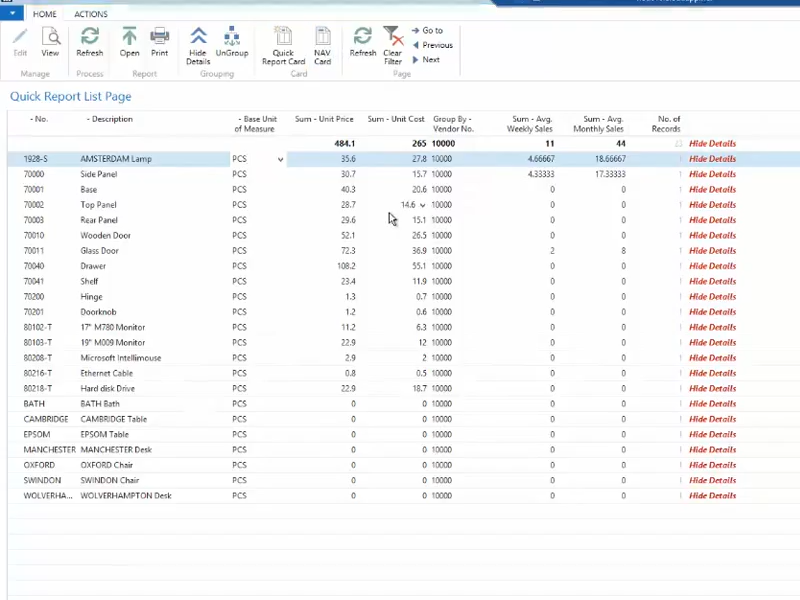
To get started just select the table and the fields you would like to display, set some filters (perhaps a date filter on sales to show sales this month/last month etc.) and your report will immediately be available. It’s that simple! Once your report is built you can display the results as an interactive list allowing grouping and column re-arrangement. Alternatively, hit the ‘Chart View’ button and now your data can be shown in various chart types such as a bar chart, pie chart, line graph etc!
If you want some more control over the defaults for your report you can create the report directly as an nHanced View. This allows you to specify the default groupings, the default totals and default chart type.
Using our nHanced Panels & Tiles? Great, you can now run your report or nHanced View directly from a tile or Link on your role centre! You can even include nHanced Tables & Fields if you use those as well!
Examples
- Customers with a balance grouped by Salesperson Code
- Items with no Inventory grouped by Vendor
Features
- Create for any table (standard or bespoke) in Dynamics NAV and Business Central
- Simple to set up with no real training required
- Show reports as various chart types
- Run directly from a tile on the role centre


